In what ways does your media product use, develop or
challenge forms and conventions of real media products?
In recent studies, we have looked at titling of successful thriller films, and thriller research.
From the research I found, we are usually introduced to the protagonist of the film in the opening, however without the context we are unable to tell sometimes. Also, sometimes in film openings, for example "The Usual Suspects" the opening, is actually connected with the ending. Sometimes it works better to not have everything in chronological order because it makes it seem fragmented.

This establishing shot from the opening scene from "The Woman in Black" shows how distorted the colour is. It is always important to notice things in shots like this, because it gives away what time this was set in, because it is clear from the props, that it isn't a modern day setting.
In thrillers, the lighting tends to be a lot dimmer than if it was, say maybe a comedy or a romance. One of the main points of making a thriller is to raise the enigma in the audience and obviously 'thrill' as well as entertain.
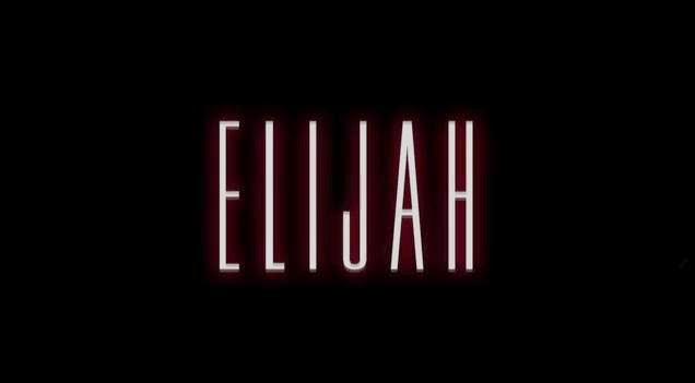
It's centered on screen so your eyes are immediately drawn to it. The red glow has many different connotations, but in this case we wanted it to represent danger, blood and evil.
for example - Cabin in the Woods used red writing to show their directors and actors (on the right)
Another thing with titling I've learned, is that half of the time these days, actors names don't get mentioned at the beginning of films, but in the credits. You tend to only see the director mentioned. Not always, but mostly.
However in our film we featured ourselves in it. At first this was a difficult process because all the fonts looked really amateur with our theme, along with fonts like "Comic Sans" which doesn't really have connotations to scare an audience. So instead we created all the typing in Photoshop and inserted them as photos and added fade in effects to them.
As you can see we have a very basic font for our characters and people who were involved in making the film. The font and colour matches our title "Elijah" which all ties together. Again, the black background suggests evil and alone.
Soundtracks are very important in thriller films and you tend you get music which builds to a crescendo. In our opening, we did achieve this! With a soundtrack called "Long Note Two" we found that it would slowly build up with its eerie tones to create an enigmatic tension when showing our production companies and other titles.


This needs considerable development Meg, it is still too underdeveloped. Identify all the main characteristics or conventions of a thriller film and then show how you have used these. Always draw parallels with existing real thriller films. Do the same for your titles as well.
ReplyDelete